Thursday, 31 May 2012

Graphic User Interface - Reflection

What did you do and how did you do it?

For this unit we had to create a GUI interface that would be used for our game's 3D environment. This being all theoretical we'd use a frame in our game and conceptually develop an GUI based upon that frame. Before placing a frame, I created 3 concept designs based upon typical or popular GUI designs. These concepts are available on through this link. After penning these designs I recreated them using Photoshop, these Photoshop versions included a frame from the my part of our trailer. These designs are available here. From these Photoshop versions I selected my favourite which was the Role Playing Game example, then I recreated it again using Flash. With Flash I created roll over buttons on the GUI elements that would change when players either selected these elements or on screen prompts told the player about them. 

Does the final graphic user interface meet your original intentions? If it does match your planning explain why?

Since I've completed this unit relatively quickly I pretty much matched my original designs, well at least my first concept which was the RPG example. I developed this design on Photoshop with a frame from my game environment. After the Photoshop example, I finished my original design using Flash. The concept to final product is pretty much 100% identical.

How did you manage your time?

I managed my time extremely well with this project, everything regarding the project besides this reflection was completed within two days (2 actual days). I spent around 5 hours on planning which 2 were allocated to concepts. I wanted to construct the planning properly so I spent a good amount of time on it. Photoshop didn't take that long as I used simple tools to get the concepts looking right and with colours it looked like a real GUI. Flash had taken slightly longer than Photoshop even though I only had one to do but this was due to playing with settings and remembering how to make roll over areas (buttons) over the GUI. All in all the time on this project was used well and effectively.

What did you struggle with?

To be fairly honest, pretty much nothing. The only place I slightly struggled with in this process was with Flash but I eventually remembered the skills I learned last year when I made my Flash questionnaire game. Here is my evaluation for that project.

How does your finished graphical user interface compare to professional examples?

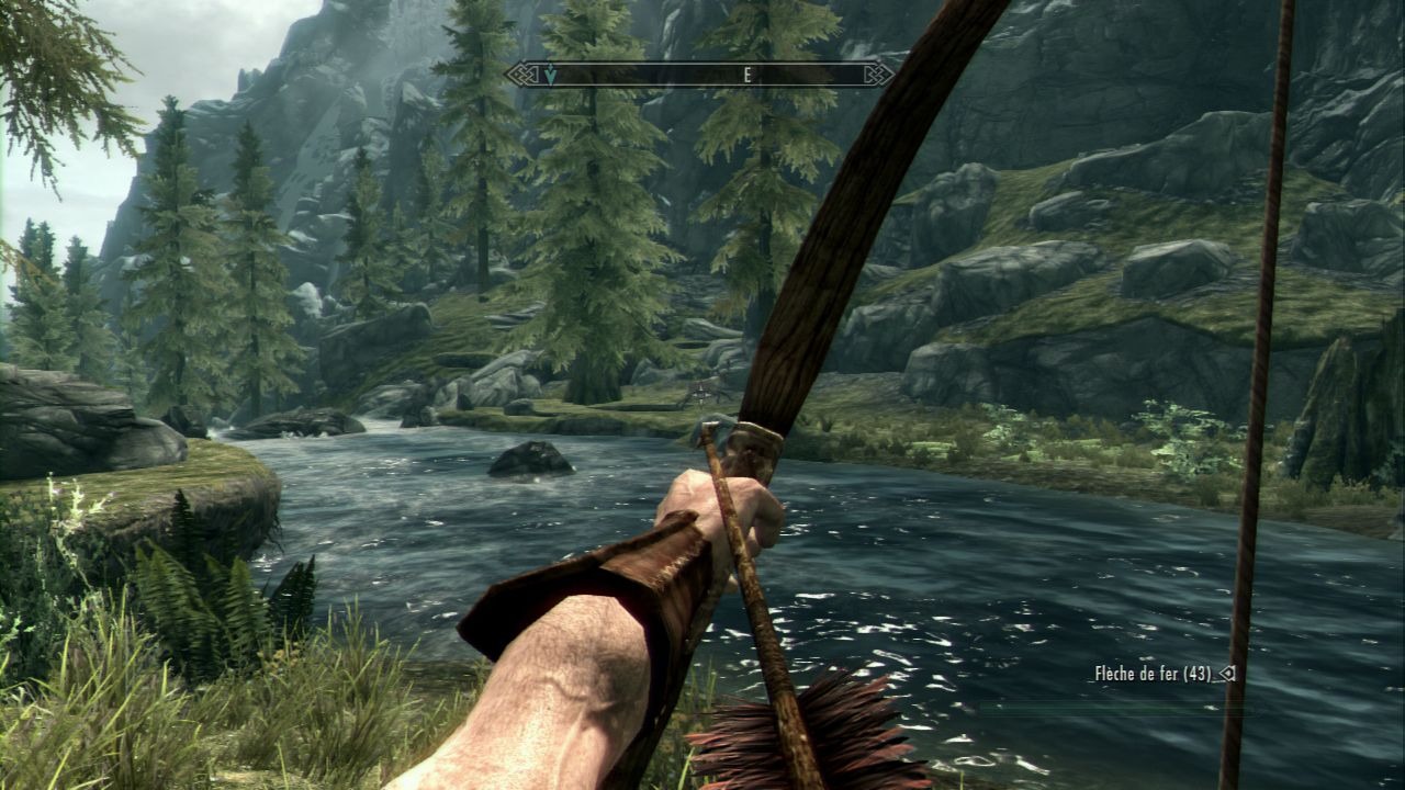
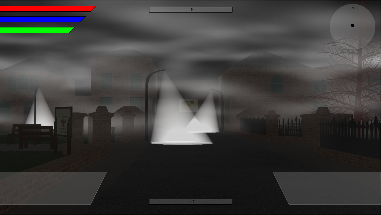
In my planning I showed my inspirations for my concepts, I then developed the concepts to look realistic in colour on Photoshop. Finally I finished my RPG example on Flash with roll over areas. My final GUI looks very similar to the professional example I showed at the end of that blogpost. The only additions were the mini-map in the top right and a constant level bar at the bottom of the GUI. Here is a professional example of Skyrim's GUI and below it is a screenshot from my final Flash GUI.

What could you improve upon?

I guess I could of done more with my final Flash GUI, I'm more than satisfied with it but I could of done a lot more. I achieved what I wanted with it so it's not a major issue and it isn't bothering me but that's were I could of done more.

If you were to do it again what would you do differently next time?

To repeat what I said in my last statement, spent more time with Flash and padding out my GUI with multiple GUI layers.

What did you learn?

I learned that using my time effectively I can complete work in a relatively quick amount of time. I started this unit on Sunday and completed everything besides this reflection by Tuesday. If I applied this concentration and motivation to all my work I'll probably achieve better across all my work on this course.

Here are some more screenshots of my final Flash GUI.

Monday, 28 May 2012

Graphic User Interface - Photoshop

Continuing from my concepts, here is my Photoshop versions which include my 3D environment which I completed early in the month and was shown during the digital showcase on the 10th of May. I'll run with the same order as the last post, Role Playing Game example first.
Second example would the Open World example.
And last is the action / adventure and shooter genres.

Graphic User Interface

The graphic user interface or GUI is a information device used to convey data from the screen to the user. It's available to the user visually, more prettier than text but with colours and shapes. Seeing the content present on the screen, but it seems like it's talking to you rather than you just reading it, that's the sensation I get anyway.

A great example would be the dashboard of a car, everything is visually seen but you understand the information like it's second nature. Translating a game GUI and a car dashboard is done in similar ways, visual data is fired at you in both circumstances. Game simulators today, especially car simulators use either virtual GUIs or it forces the player to understand the car's virtual dashboard as the real thing, this works extremely effectively, increases immersion and feels incredibly real.

Below is an image of a brainstorm / mind map of GUI features used for either Action / Adventure games, open world games or action RPGs.

Subtitles would be the only feature I'd possibly add to this list, subtitles obvious let people read what they hear. Subtitling has become more effective in the games industry of late were the text reads like it's told.

I've created 3 conceptual examples of graphical interfaces that represent 3 different yet similar genres, these examples have been influence by popular game franchises.

My first example is heavy inspired by Bethesda's 'The Elders Scrolls V: Skyrim', Skyrim's GUI offers maximum screen real estate. The GUI doesn't intrude on gameplay and the opacity changes depending on what the player is doing. For example, if you're simply roaming the landscape you'll only see the compass bar across the top. Other features may also appear like stamina and if a weapon is drawn. However, if you're battling in the game, most if not all of the GUI elements will be present during gameplay. The only additions on this GUI compared to Skyrim's is the inclusion of a mini-map in the top right corner and a experience / level bar at the bottom. I believe this examples is clean, provides tons of data than can be consumed and would look brilliant in an actual game. Considering this was at 1920x1080 the screen real estate would be immense.

This second design is similar to what you'd expect for an open world game like Grand Theft Auto. The mini-map is usually sitting in the bottom left with a health and armour protection bar surrounding it. The inventory slot is usually located in the top left or right which leaves plenty of room for other features. Simply adding a stamina bar to the right of the mini-map gives players more data. Ideally it would be more attached to the map but this is just a concept and not what a final version would look like. I've also added a on screen command or prompt below the cross-hair and a objectives box in the top right to balance the GUI more. This example seems to work for the genre it's used for but offers much less data to the player that the RPG example. With that said, franchises like GTA also include items like page devices, phones or PDAs that appear on screen. These devices offer much more visual data and which also increases the realism of their games.

And finally, this GUI is more suited to the action / adventure and shooter genres. Information is limited as the user is usually told information via dialogue or through game events that can be dynamic or completely scripted. In the top left is information about the players inventory or arsenal. Primary and secondary weapons are displayed so the player can see their equipment, this usually includes highlighted bullets and grenades that are available for player. A more advanced cross-hair is in place with a on screen prompt that features below and finally a objectives bar and can also be used to convey subtitles. A health reticule usually appears as a filter when players take damage with their game character unlike the previous two examples. A GUI of this nature is common with games like Gears of War and the Uncharted franchise. This type of interface probably offers the best nature screen real estate but also offers much less data to the player.

All in all, I believe the first example (RPG concept) offers the most visual content and if programmed correctly, would offers the best screen real estate.

These actual game examples below are the basis of my concepts; the first being Skyrim, then Grand Theft Auto IV and finally Uncharted 3: Drake's Deception.

Saturday, 26 May 2012

Audio Reflection

What did you do and how did you do it?

The idea was to create audio that was needed to add realism to the trailer, sounds like; footsteps, door sounds, wind howls and more. I decided that Foley artistry would be the best technique to capture these needed sounds. Audio is massive to a viewing experience, visuals give you the sense of the content but sound adds depth to the viewing experience that brings trailers to life. Getting the sounds through was the preferred process. Originally it was planned that sound samples would be gathered by recording in a nature environment, so for example a park. I attempted to do this for several weeks (during my sound sessions) but with no luck. Almost every attempted was spoiled by background interference or sample wind effecting the audio device during recording. The focus shifted soon after towards creating the sounds in a controlled environment in the sound studio at the college. This was more successful with over 9 minutes of audio recorded and having a large amount of samples to work with. I used wooden planks to simulate walking on wooden flooring, gravel in a container to simulate someone walking in a park or through ruins. Other sounds were capture during this session that were more experimental. 

Does your final audio product meet your original intentions? If it does not match your planning explain why? 

In all honestly, I'm very disappointed in the final audio that was produced by myself. It did resemble in some capacity my original intentions but didn't live up to the quality I hoped for. Sounds that were planned for were captured and sounded well enough individually, however they didn't mix well at all with my team's trailer. This could be down to several reasons but I believe the time management throughout the team was an issue that pushed audio editing to the very end of the production, the narration almost missed the final cut. 

My personal belief is that, if the team had all of the 3D components complete a week prior to the final audio cut, all audio elements would of been present in the final trailer. Since I was proceeding over editing the final trailer I decided the best decision was to cut my Foley sound samples out of the trailer, I believe this was the best decision and this benefited the final trailer.

How did you manage your time? 

I can only criticize myself during this undertaking, management was poor during this task and time was wasted with failed attempts trying to capture audio in a nature environment. Additionally, more samples (and of better quality) could of been recorded in the controlled environment during this wasted time. Furthermore, I attended the studio for additional hours (which is a slight positive) to mix the samples capture, this was in vain however as the samples didn't sound much better and was ultimately unused. If I had to score my time management skills with this task a 1/10 would be more than generous.

What did you struggle with?

On top of time I'd say understanding the software used to created and mix sound, Cubase is a great piece of software but to a none musician it was terribly hard to understand and work with. My tutor helped my with the software and introduced me with the key settings but I just wasn't comfortable with the software, this probably contributed the final product being below my hopes and expectations. Modifying the audio was a challenge in itself, it seemed like there were thousands of different modifiers available and finding one that worked was a headache. Even with the modifiers I chose I wasn't completely satisfy with the feedback. 

Foley was harder than expected also, I love the idea behind Foley and massively respect the professionals in the industry. I'd like to think I'll have a second crack at this unique technique in the future, with this experience I'm sure it'll run much more smoothly.

How does your finished audio compare to professional examples?

Comparing my final audio piece to professional examples wouldn't be fair to professional examples. I removed the audio because it would of been unfair to have included it in the trailer. I'd say it would be hard to find an audio piece even remotely as bad as mine, maybe I'm being extremely harsh on myself but it isn't comparable and comparing it would be disrespecting professionals out there.What do other people think of your finished audio?

It's impossible to receive criticism regarding my audio as it never made the final cut. My teams members felt it sounded rather repetitive and it did since it was mostly walking sounds with only a few sound bits in between. The general response regarding the rest is varied, some positive and others negative. The main criticism is that the soundtrack doesn't work well with the 3D content and it's repetitive throughout. The main positive is the trailer's introduction with PEGI age rating, radio broadcast and story narration.

What could you improve upon?

As stated above, probably nine tenths of the process would be improved upon if this was done again. Motivation would be much higher knowing my mistakes, developing my skills with the software would be up there on the list. Using controlled environments to produce sounds would give me more time to play with the audio and finally having more pieces of tat about to help create the sounds would increase the sound libraries needed for something of this magnitude.
  
If you were to do it again what would you do differently next time?

Again I'd repeat my thoughts above, more motivation, developing skills and definitely more planning. My planning was all in my head and not fully recorded, the 3D was my focus throughout and this may have contributed to the low quality of my sound.

What did you learn?

Firstly, that audio production and this process was extremely stressful but secondly, I've learned that my skills regarding audio need to be improved across the broad. I'll probably never record Foley in a nature environment again and concentrate on creating sounds in a studio setting as the results are far better in my experience. Finally, throwing everything at it (literary), especially when recording sounds can actually pay off.   

Wednesday, 7 March 2012

CONTINUITY IS KEY

This is our identity, lets use it!


Game Logo
Splash Screen
Web Banner

Monday, 5 March 2012

Red Hawk T-Shirt Design

For our marketing side of the project we've looked at advertising our product on ourselves, you could say we are walking billboards. A local business provides a service that lets users create customized shirts with preset designs or users can upload unique and individual designs. The service is streetshirts and their base t-shirt is priced at £9.99, additional designs add price to the overall product.

First, I believe having simple text slogan similar to that of Rockstar's above our product name will add a more professional look to the shirt. Rockstar started to use their "Rockstar Games Presents" to show their name, putting the name on the logos added value to the product. Replicating that with our product will no doubt add that extra touch. This increased the price by £2 and came to a total of £11.99.

Next came the game logo, this sits just below the "Red Hawk Presents" text so it looks similar to Rockstar's style. This is just my temple as my logo wasn't chosen by the team so this isn't a final representation of my design. If my design picked I'll include the chosen design. Adding this logo added a further £10, making the price £21.99. Furthermore I added the Red Hawk logo on the back, it covers the shoulder blades and fits quite nicely on the shirt. This was simply done for effect because of the positioning and shape of the logo, however it also advertises our team. This second logo design only increased the price by another £6, putting the total price to £27.99.

I'd also like to include individual team member names on the back of our individual shirts so people know us more personally during the build up to the Digital Showcase and also the actual event on May 10th.


I'd like to comment that this game name logo came out incorrect continually so I just used this broken version just to illustrate my intentions.


Regarding this second image I'd like our individual names below the Red Hawk logo.


-----------------------------------------------------------------------------------------------------------------------------------


Update: 06/03/2012.


Red Hawk team members voted on individual shirt designs, it was decided that my design would be the best for print yet additional changes need to be made. Team hinted at looking at a cardinal red colour to compliment the Red Hawk logo. My game name logo was just a template and the correct one will be applied for the final design.

Black Design Front

Black Design Back

Cardinal Red Front
 
 
Cardinal Red Back

Both colours look good, both priced at £27.99. A future team discussion will decide the final colour of our shirts, either way I'm happy and they look professional.

Tuesday, 28 February 2012

Planning and Editing

During the evening sessions on Monday I sent time on modifying my environment plan. Due to time away from college I've spent time catching to others in the whole group and my group. This environment plan continued through Tuesday morning and evening with a 1 hour session dedicated to sound planning. Both planning documents need completing mind, sections are complete with both plans but they need finalizing so I can begin actual production work. Due to time off I'll have to spend time at home and during the holidays to catch up with work.


Screen shoot above is a slide from my environment planning document.


As a little taster session today with a stand in tutor we looked at Windows Live Movie Maker. We was given a task to take video clips provided and to edit them into a correct order or 'continuity editing'. The task was quite hard I'd say as the order was quite debatable. After finding an order that suited me, lets say. I played about with the software, cutting clips that contained content that I didn't like. I also played with visual effects as well. Furthermore I modified time by speeding sections up and other down.

Thursday, 23 February 2012

Marketing Promotions

For the project we, Red Hawk have to design promotional content or a promotional campaign to accompany our actually production. The promotional work will include the actual promoting of our work but also promote the development process and we'll hopefully have platforms to showcase our work on. For example, we hope to showcase our work on popular social network sites such as; Facebook, Twitter and YouTube. The idea is to promote our content  and what we're doing in different ways, Facebook and Twitter offer a wide range of promotional tools were as YouTube is very specific and will be a great asset for video content, which in turn is the main project anyway. The great advantage of using these platforms is that, they're free and extremely popular with people.

Visual content needs to be developed for these platforms. For example, we need banners and visual content of the product on sites. Creating visual concepts and promotional content on Photoshop and uploading this content for our promotional platforms will add that professionalism aspect but also a visual base for us to look at our development process.

This is an example of a banner I made on Photoshop. The actual banners will look similar to this when developed and published.


Tuesday, 7 February 2012

Team Meeting Announcements - Update

Agreed Trailer Aspects

Back Story
The story is based around Saltaire; a university has been developed in the park following a discovery of a stone holding power beyond mankind. The stone was named Deus Lapidem; Latin for God Stone. Saltaire was chosen by the High Council of Modern Science to host a university for research of the stone. The “Titus Memorial University of Molecular Science” was opened. Scientists tried to understand the stone, years of research lead to full contact interaction. Scientists moved on to other experiments to try and unlock more applications. Whilst this was taking place, wicked people wanted to use its power in such ways that would harm the very existence of humanity.

This is a brief description of the back story developed by Joseph Connell, a Red Hawk team member.

Content

Environment: Tomb, Memorial Centre, University, Park and Victoria Road.
Character: Main Protagonist, Lions, Stone Zombies, Spectre, Hawk (Intro and potential Easter egg).

Sound Direction

- Trailer Music; development process for the trailer theme hasn’t been fully discussed; work regarding this aspect will follow once actual concepts are discussed.
- Narration; Narration to be developed in the trailer through radio broadcast, hence Lewis Radio. The idea is to have the radio as a natural use of narrative, a potential monologue that discusses humanities survival.
- Sound Effects; wind, howls, footsteps, door creaks, lion roars, animal noises and zombie groans.

Other Aspects

Team Introduction; an animated 3D model of a Hawk will open are trailer. The Red Hawk represents are team.
Transitions; will divide the trailer into certain sections, cutting from environment to environment. The transitional screens will either hold quotes regarding the incident that start the downfall of humanity or what’s relevant to the game’s story.

Production & Marketing Plan

Job roles were allocated to team members during the team meetings. Although some members have more production work currently, these roles are subject to change in both production and marketing.

Production Job Roles

Ivo Anusic (Team Leader)
  • Environment - Park
  • 3D Characters / Objects - Lions & Main Protagonist
  • Photoshop - Texturing
  • Sound - Dubstep Track
Lewis Corcoran (Co-Leader)
  • Environment - Park
  • 3D Character / Objects -  Female Spectre, Radio Prop & Park Props
  • Photoshop - Texturing
  • Sound - Radio Narrative
Alex Forbes-Wake
  • Environment - Memorial
  • 3D Objects -  Memorial Props
  • Photoshop - Texturing & Splash Screens
  • Sound - Foley Artistry
Adam Thompson
  • Environment - Tomb / Crypt
  • 3D Objects -  Tomb / Crypt  Props
  • Photoshop - Texturing
  • Sound - Dubstep Track
Myself
  • Environment - Village
  • 3D Character / Objects - Titus Statue, Red Hawk, Uni & Park Props
  • Photoshop - Texturing
  • Sound - Foley Artistry
  • Trailer Introduction
Joseph Connell
  • Environment - University
  • 3D Character - Stone Zombie
  • Photoshop - Concept Art, Transitions & Texturing
  • Sound - Dialogue and Story Narration

Marketing Job Roles

Ivo Anusic (Team Leader) – Promotional Adverts
Lewis Corcoran (Co-Leader) – Game Icons (Steam, App Store and Android Market)
Alex Forbes-Wake – Web Advertisement
Adam Thompson – A6 Flyers
Myself – Facebook, Twitter and YouTube Promotions
Joseph Connell – Promotional Posters

Tuesday, 31 January 2012

Game Logo Graphic

Following last week's meeting each of us had to recreate a logo for the game. Logos are important as can be rememberable. Famous franchises have famous logos or text fonts. Halo's logo is unique due to it's font type, example below.


Other games use simple font types and sell their products though the name, Elders Scrolls would be an obvious one.


I was influenced by Bethesda's take with their Elders Scrolls franchise. The name is more important than the logo, detail wasn't require, just old font types. After selecting font types I added more effects to the logo like a lens flare, red clouding and a light source within the cloud omitting from the bottom right. My logo developed away then from an initial logo to a test splash screen. I added social network logos, distribution services and our team logo.


The team gathered together once our individual logos were complete. We discussed which logos looked good and moved on to combining the positive elements to the final logo design. Individual game logos are below.


Starting with the top right is Alex Forbes-Wake's design, he used the icons from my design for his logo with an added PEGI game rating. His design was received positively since it had a decent feel to it. The fonts, effects had relevance to the story which was decided in the previous team meeting. The bottom left logo was design by Adam Thompson. His logo wasn't quite finished at this point, so his logo wasn't considered unfortunately. Although late his Greek text style and textures were impressive and hopefully this will show in his production work. Both the central and right bottom logos were designed by Lewis Corcoran and Ivo Anusic. The main positives here were the connections with the lions, they have a major relevance to the story and were a cool touch.

The team developed the positives into a final design, Alex's game logo was connected with the icons I gathered and red direction in the smoke. The lion idea that both Ivo and Lewis used was included with our tutor advising us to include Titus to the logo since it had relevance also. The main reason these ideas were chosen was due to the relevance they had to the team and the story. Alex was chosen to develop the final design for two reasons, his Photoshop skills and the main component was his design.

Final Logo Design


Alex added nice touches to the design with the ghostly style Titus and lion. Additionally the red bleeding from the text is rather good as well.

Wednesday, 18 January 2012

Individual Back Story Ideas

This post is to plot my vision on how Red Hawk Studio should present and develop its first game trailer. I'll be detailing key sections of the trailer and certain aspects I like to see in the trailer.

Information regarding team members.

Required Aspects;
Game name - The Awoken: Guardians of Titus.
Logos - Team logo, platform hosts (I.e. Steam, Android and App Store), BBFC and PEGI ratings.
Text Disclaimers - Copyright and licensing information.
Credits - Team members, roles on the production, additional credits regarding music used and applications.

Agreed Aspects;
Setting - Modern / Futuristic Horror.
Genre - Action / Adventure Horror; this is the focus point with an added sub-genre of puzzling.
Locations - Roberts Park, Tomb / Crypt, Streets of Saltaire. 
Sound Direction - Lewis Radio, working name (Natural Narrative).

Environment Development;
My ideas regarding location development for the project, what I think will make our work stand out.

Roberts Park
- Modern Architecture; Structures and Crafted Art.
- Modern Park Facilities; Futuristic Bins, Lighting, Pathways, etc.
- Minor Environmental Destruction.
- Old Famous Structures; i.e. Titus Statue.

Colour Scheme
- Whites, Metallic, Blues, Creams, Greens.

I'd like the architecture to be similar to middle-eastern / Valencian architecture. Although this type of architecture has already been constructed, it feels to me timeless and will probably be relevant in the future as well. The colour schemes will link with the architecture planned for the environment. These colours will compliment the structures and add a more human aspect to a horror / destroyed world.

Tomb / Crypt
- Statues
- Artifacts; Basic Treasures, Coins, etc.

Colour Scheme
- Metallic, Creams, browns, Grays.

This direction seems obvious but most treasure rooms share these qualities, the tomb / crypt would have been constructed in Titus' time so keeping this known theme seems the best option. The colours here will stick to the natural / obvious theme used for tomb and treasure rooms.

Streets of Saltaire
- Recreated Village; Streets, Buildings, etc.
- Famous Structures in View; Salts Mill, Church, Victoria Hall, College Buildings.
- Minor Environmental Destruction

Colour Scheme
- A vast array of colours will be used for this environment; reds, blues, creams, browns and so on.

I believe it's important to develop these structures in our production, using simple 3D techniques we could recreate the village and the famous structures without compromising time. The housing can be duplicated for several streets, we know that Victoria road is the focal point and the other streets will be used for viewing purposes only so detail won't have to be massive. Colours for this location will be vast, each house having a different colour to the next. Creams will be heavily used as the structures are made of sandstone.

Destruction of this environment should also be kept to a minimum. I idea is that although the world has been destroyed and almost consumed by death, Saltaire was abandoned years before the breakout. The village was kept as a historical marker of time, unused but visited. The only area that was redeveloped was the park, modernised and fit for use. This is my vision, a contrast between the two. Modern / futuristic park sitting side by side with the old clapped out village.

Character Development;
My ideas for the environment are greater than my ideas for the characters. I'd express small details / touches which I'd like the characters to have.

Main Protagonist
- A treasure hunter survivor.
- A lone wolf who operates on his own.
- Although he works on his own, he does help other survivors in need.
- He's recongised as a saviour by these he's helped.

Attire
- Worn cloths; dirty through fighting and scavenging.
- Clothing covering his lower face and goggles covering his eyes for protection.

Sir Titus Salt
- Static character, appearing vocally through his statues in the park and his crypt.
- Offering riddles and advice to the main protagonist through his adventure.

Attire
- Statue attire, bronze sculpted suit.

Lions
- All four lions; war, peace, vigilance and determination will harbour powers that will be unlocked by the main protagonist through his adventure. Such powers will help save humanity from the clutches of death.
- All four lions will be in statue form, they'll break out of the stone to be seen in a mechanical form. The guardians of Titus, suiting red eyes.

Red Hawk
- I believe the trailer should open with the red hawk flying and then landing on one of the known buildings, maybe Victoria Hall at night. The hawk would seem like a silhouette until it landed on the building and its powerful red eyes glowing towards the camera. The red eyes would symbol the studio name but will also have relevance to the story, linking with the lions.

Additional Cast
- Zombies; Hostile enemies.
- Animals; Passive creatures.

Sound Direction;
- Trailer Music; Slow paced emotional music that leads to a more dramatic piece, the music develops along side the images in the trailer.
- Narration; Narration to be developed in the trailer through radio broadcast, hence Lewis Radio. The idea is to have the radio as a natural use of narrative. A potential monologue that discusses humanities survival.
- Sound Effects; wind, howls, footsteps, door creaks, lion roars, animal noises and zombie groans.

Other Aspects;
- Transitions; Transitions in the trailer should be a strong point of consideration. I believe text expressions should be visible in the environment and not in transitional screens. Telling the story in the environment, similar to the opening credits of Superman Returns.
- Fade to black; This should also be considered greatly, lets limit the number. Once at the beginning for the Red Hawk Studio introduction, a few times in the actual trailer and two times at the end for the splash-screen and credits.

Inspiration
The inspiration of ideas comes from popular games and films regarding treasure hunting and apocalyptic survival. On the architectural side it comes from architecture from Valencia and the Middle-East.

- Indiana Jones
- Uncharted
- Zombieland
- Fallout
- Middle-Eastern Architecture
- Valencian Architecture

Tuesday, 17 January 2012

3D Environmental Design - Test

Today we looked at modeling buildings using basic primitives. From the basic primitives we had built some what decent buildings using shapes like box and planes. For the boxes we used modifiers, for the arch we used bend. I bent the box a 180 degrees then I extruded the ends of the box to create the window frame. I extruded the ends together and extended the front and back for ledges.


Additional ledges were added between the windows for additional effect. The door was created via the window frame but was scaled down by width but scaled up by height. The face of the building was made using a plane and I used F12 shortcut to spin the plane around.


Other tasks should of been explored like adding a more comprehensive texture, ledges, extruded overhangs, sky box, lighting and a roof. I tend to play with modifiers and loss time on them like playing with tessellation. Tessellation will naturally slow machines down as it generates a high number of polygons and this was the case.


The intention of this test was just to play around with the settings and to see what we could produce in as little time as possible. These houses can be duplicated as the streets of Saltaire have the same architecture.


This is my test building during this exercise.


26/1/2012 Update

In the latest 3D session I was playing around with box modeling and interior environments. A simple corridor was created with the end polygons deleted, orifices on either side to resemble doorways. Normals were flipped and a floor texture was added. Using the editable mesh tool I extruded a section of the corridor that lead to another box, I deleted polygons from the second box and recorded the measurements. Getting the extruded corridor and the second box to fit together perfectly. Using the attach tool connected both sections together. A simple wooden floor texture was used throughout the interior. I added a skylight to add atmosphere and a spotlight for further effect.

Environment image below.

Monday, 9 January 2012

Planning An Environment

For my planning of the environment I looked at images that were taken by the team. I wanted to have the bridge in Roberts Park on my planning drawing. This was the image taken which I worked upon.


I wanted an image with a two point perspective but I also wanted an image with specific feature of the park, the bridge. Unfortunately the most suitable image didn't have distinct features for a two point perspective. The first drawing didn't require high detail and I had drawn key areas with basic shapes. The next step was adding more detailed shapes and shading methods to the pencil drawing. I used a fine liner to cover the original shapes and added more shapes with it. I used cross hatching, shading and swirls to add more depth to the drawing. This is how it can out;


I modified specific sections to match the development direction of a futuristic/modern horror environment. The trees had gone, the bridge has been modernised with the guard rails in the environment and the bins have been upgraded with a modern twist. The swirls were for the green hills and cross hatching for concrete and the bin. Water and Glass had simple strokes to define the material.

I needed to recreate the drawing a second time to add colour to the drawing. Four equal sections using different techniques; Fine liner, Pencil crayon, pastels and felt tip pens. This was done on A3 cartridge paper (as the previous drawing) so the colours didn't leak through to the other side. The depth of the colours indicated more detail in the drawing. The crayons and felt tips were less than useful and not desirable to look at. The pastels however (although incredibly messy) made the drawing look darker and relevant to the art direction the team is going for with our game trailer.


As you can see from the image, both bottom sections of the drawing have been some what effected in a negative way by the use of the felt tips and crayons. The top right has modified by fine liner and the top left by pastels. The pastels bring out the feel and idea of how we want are trailer to look like. Dark, gloomy, atmospheric and scary.

Tuesday, 22 November 2011

Unit 70 LO1 - Brainstorm

Our group, Red Hawk, looked at how we would develop the results of our survey which was conducted earlier in the year. We considered 3 themes revolving around Sci-fi horror; slow pace horror, fast pace horror or silly horror. Slow horror similar to Amnesia, fast horror like Doom 3 or something silly like Dead Rising. Each team member detailed their ideas and reasons for their ideas.


My ideas;
- Slow paced horror with silly horror elements due to time constraints.
- Dialogue and traditional transition screens dropped with text in the environment or text coming out at the screen.
- Physical presence in the trailer rather than spectrum activity.
- Milner field house (Haunted house)


Key ideas noted were Lewis Radio (Themed radio broadcast), Titus Tomb (under his Statue), Importance of horror content (zombies, ghosts, psychological themes and atmospheric music).


Key must haves in the trailer;
- Team Logo
- Game Logo
- Splash Screens
- Distribution Logos (Steam, App Store, Android Market)
- Age Ratings (BBFC, PEGI)


Team ideas below detailed in the image;


Thursday, 10 November 2011

Music and Feelings

Only certain types of musical genres make me feel anything. Most music is passive to me, I either don't care about it or it doesn't do anything for me. My favourite genre is symphony, in my opinion it's the purest form of music. Instruments do more for me rather than lyrics. The English language makes words sound so redundant; Latin, Greek amongst others make words sound more appealing... for me anyway. I like the aggressive, strong or powerful notes in symphony pieces. I love the velocity of tempo, the high frequency as well as the short powerful notes heard with brass instruments.


This score features both elements I enjoy in this form of music.


One of my favourite scores ever; the trombone adds to the piece, without it I wouldn't enjoy the music.


This is the case for both God of War III pieces as well, Greek lyrics add to the sounds heard.